Website: Research
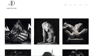
Jono Dry Website
Since I am constructing my website, I felt it was important to do research about websites of artists that I admire and that are an inspiration for me. Who knows me, knows too that one of my favourite artists is Jono Dry. Therefore, I started my research with his website.
His website clearly reflects his work and the person he is or demonstrates to be. I have followed his videos and posts in the last few years and he only uses monochromatic for his artworks. Therefore, his website is no different.
In general the website is very clean and formal and the information is very clear. Moreover I like the type of text and the quantity of space he used. I think this is a good website, in which everything reflects the artist and his artworks.
Thierry Duval Website
Another artist that I love is Thierry Duval. He is famous for his hyper realistic watercolours of urban scenes. I follow him on Instagram but I had never seen his website, so I thought this was a good opportunity to do it.
Although I love Thierry's artworks I felt that Jono Dry's Website was better organized. Thierry's Website has too much information and subpages, something unnecessary. It could be more clear in general. Furthermore, there was no "Contacts" page what I thought it was strange but then I noticed that it has his contacts in the top of the pages.
Researching the website of these two artists made me realize what I should and should not do in my website.


You needed much more detailed commentary here about the user experience of the site discussing the design, navigation, links and ow it was to use and how useful this was to understanding how your work should be.
ReplyDelete